Loneliness maps
What makes older people at risk of being lonely, and which neighbourhoods have the highest risk?
About the loneliness maps
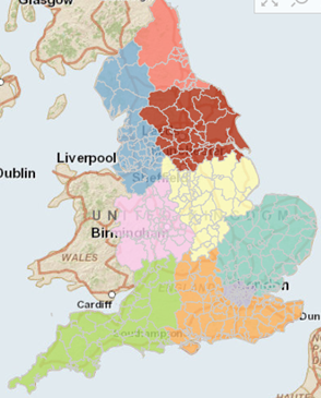 The heat map shows the relative risk of loneliness across 32,844 neighbourhoods in England. The relative risk of loneliness is based on the Census 2011 figures for the factors:
- marital status
- self-reported health status
- age
- household size
These four factors predict around 20% of the loneliness observed amongst older people 65 and over as represented in the English Longitudinal Study of Ageing (ELSA).
How to use the loneliness maps
The Age UK Loneliness heat map should be used alongside local knowledge and an understanding of local neighbourhoods. When this happens it can improve the allocation of limited resources to reduce loneliness across a geographic area and help understand whether existing services are reaching areas of need.
Case studies in Wirral and Rotherham provide examples of how the Age UK loneliness heat map has been used to target resources and raise the profile of loneliness among older people in a local community.
View the loneliness map
Discover how lonely your neighbourhood is
More resources on loneliness
Research reports on loneliness issues that older people may face.
For more information call the Age UK Advice Line on 0800 169 65 65 (8am-7pm, 365 days a year).